How to Present Graphics and Data in Technical Writing


Table of Contents
In technical business writing, the graphics and data – such as engineering drawings, numbers, tables, and process diagrams – complement and are integrated with the text to inform or even to entertain the reader, depending on the writer's objective.
In this post, you will learn how to correctly and incorrectly use different types of graphics and present data in your technical documentation.
1. Pick the right data presentation format for writing graphics
Charts, graphs, and tables vary in effectiveness. The right data presentation format depends on the visual's purpose. Here are good rules to follow when selecting a format to present your data:
- Line graphs are good for showing change over time.
- Bar graphs effectively compare quantities.
- Pie charts clearly show percentages of a whole.
- Flow charts show processes or hierarchies.
- Histograms help readers to visualize the frequency and distribution of data.
- Figures help summarize your research.
In some cases, a visual might not be necessary. Use text to share data when it isn't relevant to your main findings or it can be easily written out in your technical document.
2. Integrate writing graphics with text
Integration is bidirectional: An effective graphic enhances the text, and effective text enhances the graphic. In other words, we want to go beyond simply pointing to the graphic in the text, which we would not consider “integration.” We also want to explain the graphic to the reader in the text.
Indeed, depending on the subject matter, it's a good practice to create the graphic first, to bring together some of the relevant concepts, and then walk the reader through the graphic to make sure all readers will have a common understanding of the graphic and its significance. Using this technique, we can instantly create pages of explanatory text that help the reader understand and helps us tell the story.
Please note that we are not talking about how to choose among various kinds of graphics, e.g., organization charts, flow diagrams, and the like. We simply want to explore the relationship between the graphic and the text.
For example, suppose we are writing a contribution to a business blog. (Where did that idea come from?) Figure 1 below shows an overview of the blog writing process.
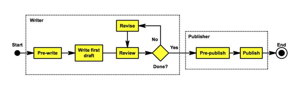 Figure 1. Blog Writing Process.
The figure answers several questions for the reader:
- What are the steps in the writing process?
- What is the sequence of steps?
- What are the respective responsibilities of the writer and publisher?
At the same time, many questions that could be raised are left unanswered. For example, what activities are involved in “pre-write” or “pre-publish”? The figure doesn’t say. The narrative needs to describe the activities.
Alternatively, we could have listed the component activities of each process step in the process box.
We could have added the following to the pre-write box in the graphic:
- Audience analysis
- Article objective
- Preliminary research
Of course, instead of simply listing the activities, we would also expect to elaborate, so that the reader ultimately understands the scope and objective of each activity. This elaboration is certainly not advisable in the graphic under any circumstances; it’s too much detail.
A good default practice is to provide just the big picture in the figure, as shown, and then provide details in the supporting narrative, thereby integrating the graphic and the text. In the given example (because of the missing detail) the reader, looking at the graphic, is implicitly encouraged to ask questions and to look to the text to fill in the blanks.
Video can also serve as an integrated visual when a process is better demonstrated dynamically. With modern AI tools, you can convert text to video to generate brief explainer clips directly from your narrative outline, then reference specific moments in the video within the text (e.g., “at 0:18 the valve closes”) to reinforce key steps. Keep the clip focused on the essential actions, add captions for accessibility, and embed a still frame in the document as a figure with a descriptive caption. As with any graphic, ensure the video complements—not replaces—the explanation and avoids decorative filler.
For the writer, the high-level graphic is a wonderful organizing mechanism. Using the figure above as a starting point, the writer is now in a position to rattle off the details in the supporting text. Without the figure, the task of describing the flow in words, and then adding detail, is substantially more difficult.
You may be interested in our beginner's guide: How to Become a Technical Writer

3. Integrate tables and text
The question of the level of detail may be answered differently for a table, which is inherently a text-intensive form of graphic. You should strive to make the table fairly self-explanatory, leveraging the table structure to show the reader relationships among data elements.
As with other graphics, the table is intended to augment the narrative – typically to strengthen an argument or to illustrate a relationship among data elements. You still need to make the connection for the reader between the table and the argument, or between the table and the relationship.
For example, consider Table 1a and Table 1b (below). Let's suppose we are a contractor bidding on a government solicitation, requiring three labor categories, with the minimum experience and education levels for each category shown in Table 1a. We want to show that our proposed candidates for each category meet the experience and education thresholds, as shown in Table 1b.
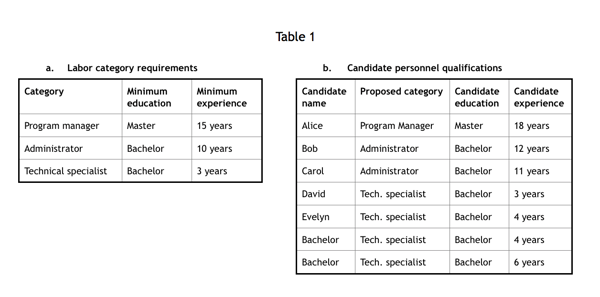
It may be evident to the reader who examines the two tables carefully that each candidate meets the minimum education and experience requirements of the appropriate category. However, we want to make that point explicitly in the narrative to make sure the reader understands it. Again, we are integrating the table with the narrative.
Hint: A chart or graph that needs explanation needs to be reworked. Make it easy for your readers to decipher and absorb the information at a glance.
Report formatting is one of the skills we teach in our technical writing course. [Learn More]
4. Avoid decoration
A decoration is defined as a graphic that seems to have a vague relationship to the subject of the given article but is actually content-free – it adds absolutely nothing to the reader's understanding of the subject at hand.
For example, in an article discussing the job description of a software developer, an illustration like Figure 2, taken from a free image website, would be considered a decoration.
 Figure 2. A decoration is a content-free graphic.
Incidentally, such a decoration could do more harm than good in today's political environment. For example, does a photo you include imply that women and persons of color don't qualify as developers? Is that a message that we want to convey? Avoid including decorations or graphics just for the sake of a graphic.
5. Make sure the writing graphic is legible
Figure 3 is actually a copy of Figure 2, but very hard to read. The gray text on the light blue background offers insufficient contrast; the type size is only seven points (vs. 10 points in Figure 1); all of the text is in upper case (vs. upper and lower case in Figure 1).
You can ruin a good piece with poorly designed graphics and poor color combinations.
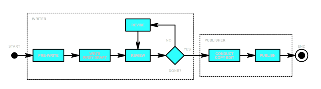 Figure 3. A poorly designed graphic.
This issue of graphic legibility is particularly significant when the graphic is a screenshot. How often do you see a screenshot illustrating the use of some software tool or showing the result of a user action that is totally unreadable?
One way to solve the problem is to zoom in on a portion of the screen so that the text is large enough to be legible. Another is to replace the screenshot with a drawing of the screen that has readable text and better color choices.
Become more effective with your visuals
As you incorporate graphics and data into your technical documentation, we recommend following Edward Tufte’s 4 core principles:
- Graphical Excellence -- “the greatest number of ideas, in the shortest time, using the least amount of ink, in the smallest space.”
- Visual Integrity -- the representation should neither distort the underlying data nor create a false impression or interpretation of that data.
- Maximizing the Data-Ink Ratio -- pay attention to the way that visualization is compiled; all superfluous elements should be removed.
- Aesthetic Elegance -- not based on the “physical beauty” of an information visualization but rather the simplicity of the design evoking the complexity of the data clearly.
What other methods would you use to make your technical writing visuals better?
If you're looking to improve your overall technical writing skills, learn more about our Technical Writing Foundations course. This course gives you writing direction, advice for presenting information, and more.

Write your own technical document and get expert instructor feedback.
Our Technical Foundations Course is available for individuals and groups online, virtually, and onsite.
View Course & Outline